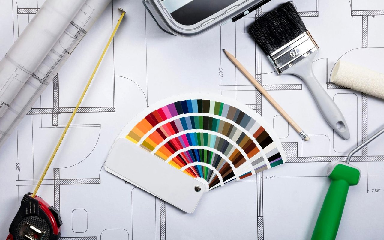
Color has power. It speaks to emotion, plays with light, and changes how we feel inside a space—sometimes instantly. Choosing the right paint color isn’t just about flipping through swatches at the hardware store or jumping on the latest trend. It’s about understanding the subtle ways color transforms a room, enhances architecture, and reflects who you are.
In a city as vibrant and architecturally diverse as Chicago, the perfect shade can elevate a cozy bungalow in Rogers Park, a loft in the West Loop, or a classic brownstone in Lincoln Park.
Whether you’re prepping your home to sell or creating your dream space to live in, color is one of your most powerful tools. So grab your brush and let’s dive into the colorful world of paint—science included, fun guaranteed.
Start with the Feeling
Before you even crack open a can of paint, ask yourself this: how do I want this room to feel?
Different colors evoke different emotions. This isn’t just woo-woo design speak—there’s actual psychology at play here. Warm tones like reds, oranges, and yellows tend to energize. They’re social, bold, and bring heat to a room. Cool tones like blues, greens, and soft purples are calming and restful, perfect for spaces where you want to unwind.
A soft, dusty blue might make your bedroom feel like a spa retreat. A sunny butter-yellow kitchen can give morning coffee that extra boost. Color sets the tone, literally and emotionally, so be honest about the vibe you're going for.
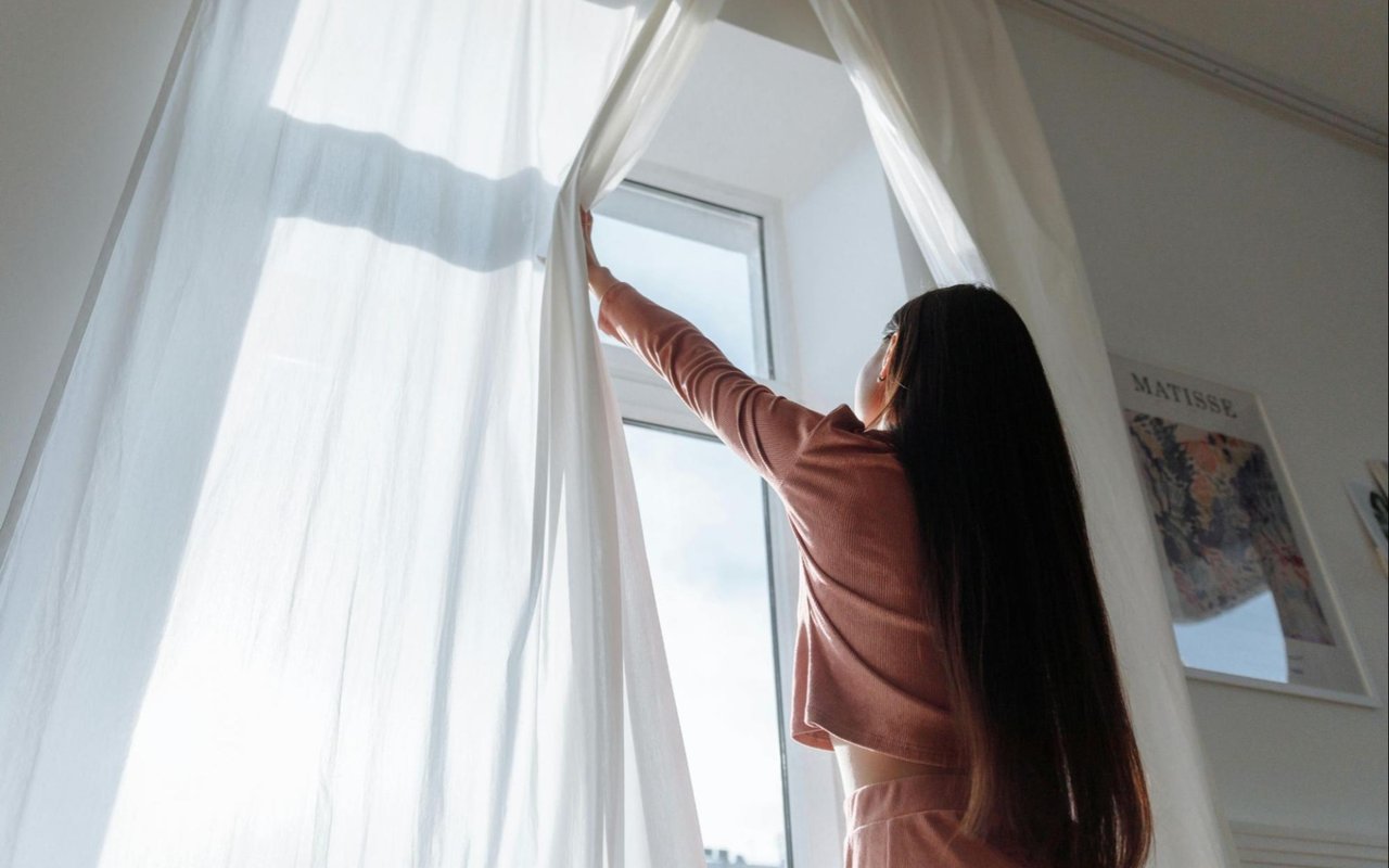
Lighting Changes Everything
Natural light is the ultimate wildcard. A paint color that looks perfect on a swatch or in someone else’s home might look completely different in your own space. That’s because light—both natural and artificial—shifts how colors appear.
North-facing rooms in Chicago tend to receive cooler, grayer light, which can mute certain shades. In these spaces, warmer tones like creamy whites or soft peachy hues can help balance the chill. South-facing rooms get warm, bright light all day, making both bold and pale shades look beautiful.
Don’t forget artificial lighting either. Warm bulbs can bring out yellow undertones while cooler bulbs can emphasize blues. Always test paint samples on your wall and observe them at different times of day before committing.
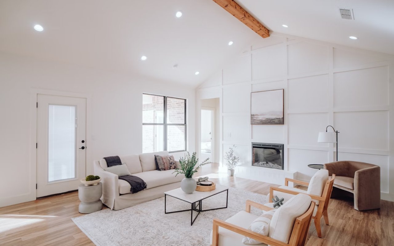
Neutrals Are Anything But Boring
Neutrals are the unsung heroes of home design. They’re the backdrop, the anchor, the canvas for all your décor creativity. But “neutral” doesn’t have to mean bland. A whole world of nuanced shades—think greige, taupe, soft blush, creamy ivory, and warm stone—adds depth without overwhelming.
A well-chosen neutral sets a sophisticated tone in spaces like the living room or hallway, where you want versatility. Consider warm taupes in a traditional Gold Coast condo or crisp white with a blue undertone for a sleek South Loop apartment. Choosing a neutral with the right undertone for your space and light is the key.
Bold Rooms Deserve Bold Color
Ready to make a statement? Accent walls are a fun and low-risk way to introduce color. You can play with contrast by painting one wall in a dramatic navy or emerald while keeping the rest of the room soft and subdued. Or, go bold from floor to ceiling. A deep forest green dining room with brass fixtures feels moody and elegant. A powder room in aubergine purple? Absolutely unforgettable.
Just remember, balance is everything. If you’re using strong colors, keep your furnishings or trim clean and simple to let the paint shine.
Match Color to Function
Each room in your home serves a different purpose, and your color choices should follow suit.
-
Living Rooms: These are gathering spaces. Consider warm grays, cozy beiges, or rich earthy greens to encourage comfort and conversation.
-
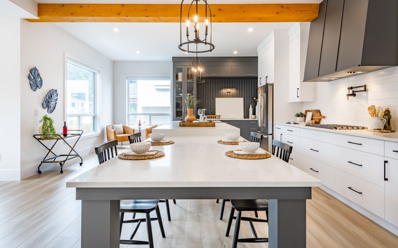
Kitchens: Lighter colors like white, pale sage, or soft blue make kitchens feel open, fresh, and inviting. They also reflect light beautifully.
-
Bathrooms: Cool hues like spa blue, soft mint, or even charcoal can make bathrooms feel serene and modern.
-
Bedrooms: Soft blues, blush pinks, lavender, or creamy neutrals promote calm and relaxation.
-
Home Offices: Green is a top pick here. It enhances concentration and has a calming effect—perfect for a productive work-from-home zone.
-
Dining Rooms: Rich colors like navy, burgundy, or chocolate brown create an intimate atmosphere, ideal for evening gatherings.
Think function first, then match the feeling.
Don’t Fear the Ceiling
Yes, the ceiling. Most of us default to white and never look up again. But painting your ceiling can have a dramatic effect. Go a shade lighter than your walls for a cozy cocoon effect, or try a rich tone to add elegance in a formal space. In a kids’ room or creative space, a colored ceiling can be whimsical and joyful.
In older homes with crown molding, painting the ceiling the same color as the walls can also make the space feel larger and more cohesive.
Sample Like a Pro
Never rely on a swatch alone. Get sample sizes and paint a few large patches on the actual walls. Check them in the morning, afternoon, and evening. See how they look next to your furniture, flooring, and trim. If you’re stuck between two similar tones, always go a shade lighter—it tends to read better once applied to an entire room.
And remember, paint is not permanent. Don’t be afraid to experiment. You can always repaint if something doesn’t feel right. It’s one of the easiest and most affordable design changes you can make.
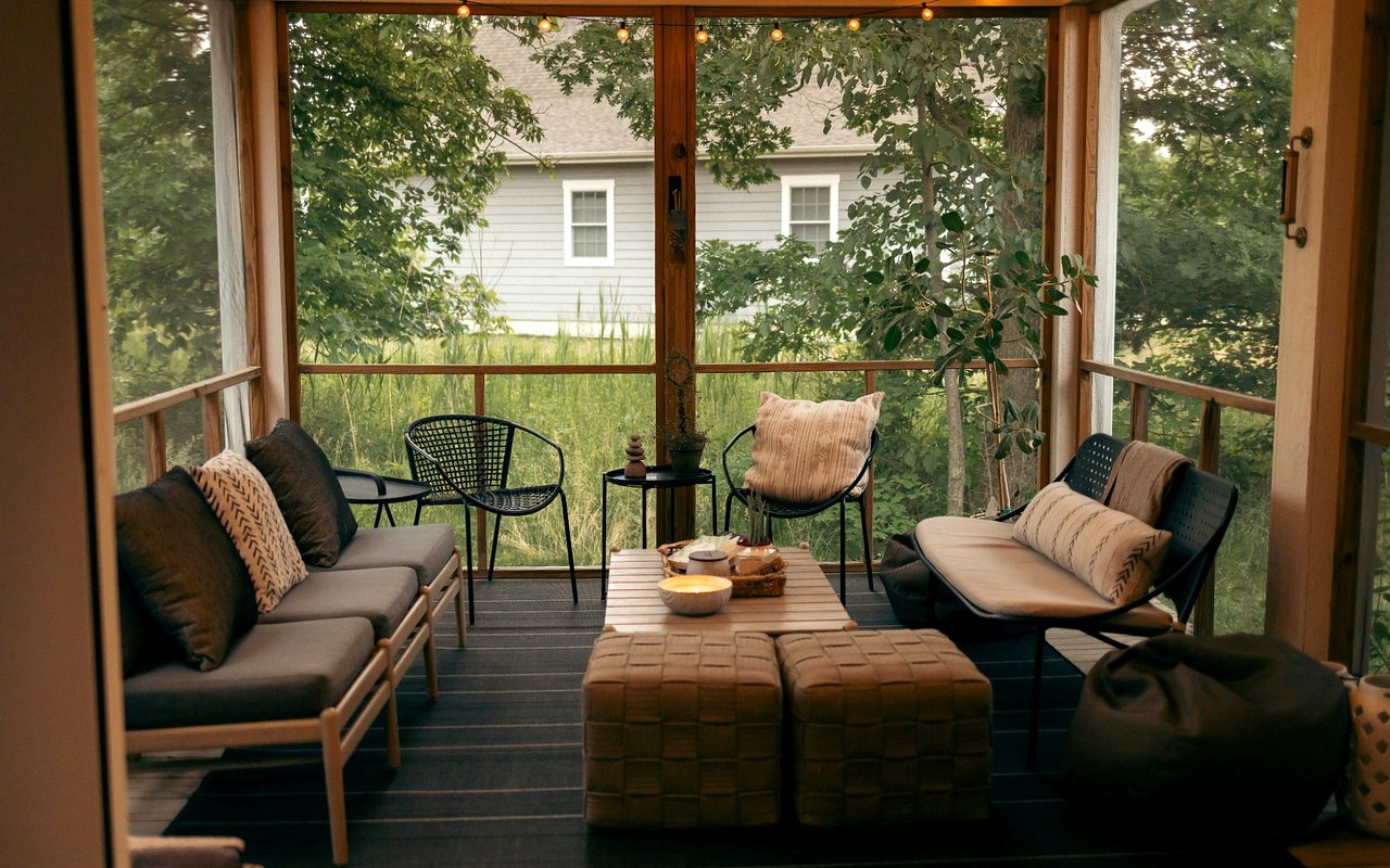
Create Flow Between Rooms
While each room should reflect its purpose, your overall color scheme should feel cohesive. This doesn’t mean every wall needs to be the same shade, but rooms should transition naturally from one to the next.
Pick a base palette of three to five colors and use them in different combinations throughout the house. For example, a soft blue from the bedroom might appear again in artwork in the hallway or in an accent pillow in the living room. These subtle repetitions create visual harmony and a sense of intentionality.
Accent with Confidence
Once your walls are set, bring color into the room through furniture, textiles, and art. That burnt orange accent chair or teal velvet pillow might feel risky on a wall, but as accessories they pack a stylish punch. Layering color adds richness and personality, and gives you the freedom to refresh the space seasonally or as your tastes evolve.
Ready to Transform Your Space?
Color isn’t just decoration. It’s emotion. It’s story. It’s strategy. Whether you're refreshing a single room or preparing your whole home for the market, choosing the right paint tones makes all the difference.
If you're wondering how to align your home’s color palette with its architecture, resale potential, or your personal style,
Jerry Goodwin is here to help. As one of Illinois' top real estate professionals, Jerry understands not just the value of a home, but the power of presentation.
From guiding color choices that appeal to buyers to helping you fall in love with your own space all over again, Jerry brings thoughtful insight to every project.
Visit
jerrygoodwin.com to connect with Jerry and start your journey toward a more beautiful, vibrant home. Because great color choices don’t just transform walls—they transform lives.